Sponsored Content | Brand Spotlight Partner What's This?
Create a Website Built to Pull in Visitors and Sales Developing a compelling website doesn't have to be complex. It starts with choosing the right template and landing page.

If you can come up with a compelling idea for a business, you can devise a compelling website for that business. In the first part of our four-part series, developed in partnership with Squarespace, we identified the key questions you need to consider to ensure the strategy for your website is in line with your business goals. Now comes the fun part—putting the website up.
Following are three questions you should consider to translate your vision into online reality.
What template is best for your business?
In the past, designing a website was a complicated affair, requiring the services of a skilled designer. While you still may decide to seek help to create your site, the process has been made significantly easier and faster by using web templates. This is a pre-made website that is about 80 percent complete. Then you add text, images, and modifications that make your website look distinct from another business that may be using the same template.
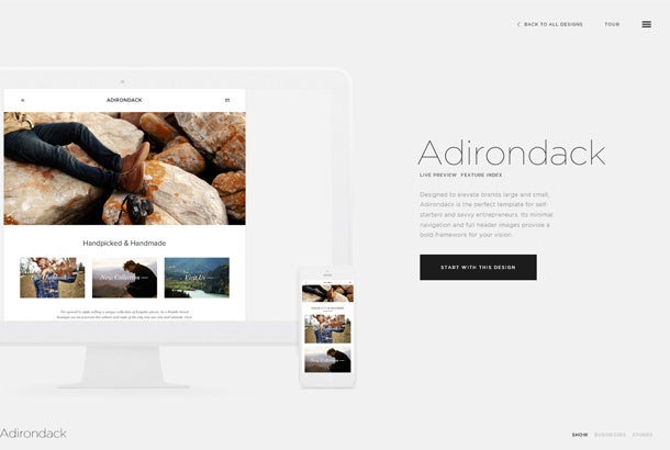
A range of web templates are available, but there's no need to feel overwhelmed. Web templates are categorized by purpose or industry—such as musicians, bloggers, and restaurants—which provides an easy starting point. (And, of course, you can choose a template that is categorized for an entirely different industry if it appeals to you.)
Carli Lampley, CEO at Apotheke, a company that makes all-natural skin products, soaps and candles, spent time looking at other websites to get an idea of the possibilities. She then narrowed her choices down to three Squarespace templates she liked before selecting one. "The important thing is not to be intimidated," she says. "Whatever you choose, you can always change. So you should have fun, and enjoy the experience, because it's only as hard as you make it."
Small businesspeople generally start with an overall vision of what they want their website to communicate. Consider Matthew Waitesmith, whose Artisbrush company sells applicators and brushes for makeup. After many years in the beauty industry, Waitesmith knew the paint brushes that makeup artists and consumers have used for decades were designed for canvases rather than the human face. In promoting his business to the world, he realized his website couldn't merely sell products; it had to communicate why people needed to apply makeup in a different way.
"I knew that I wanted a template that was a storytelling medium," he explains. "I wanted the brushes to be displayed like they were pieces of art at a gallery or museum with neutral colors."
After waiting six months for a design firm to develop his site, Waitesmith decided to do it himself on Squarespace. He found a template and put together a website that corresponded with his vision over one weekend.

box: Checklist for Template Consideration
Which color combinations are most appealing
Which layouts are easy to read
Does the template mesh with the emotional experience of visitors, such as being funny with bold colors if you are appealing to kids
What do visitors want from your landing page?
A landing page is the first thing visitors see when they go to your site. It should be designed to make an impact and lead visitors toward a journey that results in a specific action, such as click to another page, buy something, sign up for a newsletter, or provide a comment or other information.
Joylynn Holder, owner of Brooklyn Forest, a company that offers classes in city parks for young children and their caregivers, has a cut-to-the-chase view of landing pages: "We designed it from the point of view of the customer. I want to guide them through the site so they only see the options that are applicable to them. We don't add nonsense that we don't need, like a 1,000-word disclaimer."
Consequently, on her landing page, she didn't want a big logo or "acrobatics" like rotating images, but clean, sleek lines. Visitors see the words "Brooklyn Forest," with four photos that allow them to click to classes divided by location and the season of the year they're offered. The three links under the logo are "register," "parent-child class," and "about us," providing easy navigation around the site.

"We understand the information that our visitors are looking for, and having a clear navigation has really reduced the phone calls we get because they can find the information they need so easily," Holder says. "We guide them through the site to let them know the options that are available."
box: Checklist for an Effective Landing Page
Eye-catching headlines
Copy that engages
A focus on what a visitor needs
What is your call to action?
Directing visitors around your site is coupled with having a clear, concise call-to-action (CTA). This is the headline or button text that makes it clear what the next step should be ("download your free marketing report"). While a strong CTA should provide an awesome offer that makes a visitor take notice, it doesn't have to be a hard sell.
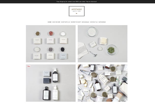
In Apotheke's case, the call to action is subtle: The welcome page simply says the company's name with the phrase "Made in Brooklyn" over an attractive image of fallen leaves, creating a sense of atmosphere, and then a button that simply says "Welcome."
"We thought about having the landing page be the products page," Lampley says. "But by having a welcome page, we create a bit of mystery and draw people in. The appeal becomes the company, rather than the products, and we tell the story of the company through pictures."
The lesson is clear: As a small businessperson, you have intimate knowledge of the customers you want to reach. Your website should be designed to give them the information they want, clearly and easily, packaged in a form that reflects the story of your company and creates an emotional impact. Creating a site doesn't need to be a daunting or lengthy process because web templates and other online tools do much of the heavy lifting for you.

In the next part of this series, we'll look at the next steps to take once your website is up and running, which will make it even more appealing, as well as ways to help prospects and customers find your site.
Build Your Site, Your Way
If you're looking to put a unique stamp on your online presence, Squarespace offers creative tools that help you easily create a beautiful website, ecommerce store, or portfolio no matter your experience level, with no coding required. Squarespace's completely inclusive, all-in-one service provides content management, hosting, domains, social integrations, e-commerce, and 24-hour customer support. Use the offer code "Entrepreneur" to receive 10 percent off your first purchase.
Read all articles from this four-part series on creating an effective website here.