The Psychological Trigger That's Confusing Your Customers And what you can do about it.
By Talia Wolf •
This story originally appeared on KISSmetrics
For countless years, businesses have been searching for their own unique selling propositions, trying to differentiate themselves from their competitors and convince customers to choose them.
Businesses go about this in many ways, such as by highlighting the different features they have, lowering prices (or, in some cases, increasing prices), or focusing on the competitor's disadvantages.
More progressive businesses focus on the emotional value their product or service provides. They emphasize how they change their customers' lives, not by supplying them with endless pairs of socks, but by "paving their way to a brighter and more comfortable day."
How Customers Make Decisions
In order to capture the attention of visitors in just a few seconds and turn them into customers, landing page design requires careful planning. There are many elements to take into consideration while planning a landing page, starting with strategy and goals and ending with a finished page, including image, colors, call-to-action button, and informative content.
Visitors rely on all these elements on the landing page to make good decisions. However, there are other elements that affect the decision-making process that people aren't necessarily aware of. These elements are commonly referred to as cognitive biases.
"Cognitive biases are tendencies to think in certain ways that can lead to systematic deviations from a standard of rationality or good judgment." (Wikipedia)
In other words, cognitive biases are tendencies of our brains to think in certain ways and patterns according to our environment. Although we aren't aware of this most of the time, the way things are presented to us has a huge impact on our decisions.
Some marketers study cognitive biases to learn how to affect the decision-making process of their potential customers. By understanding how people make decisions and what can affect that process, marketers can design better marketing campaigns, better landing pages, and as a result, better products.
The Cognitive Bias That Confuses Customers
Our daily routines require us to make many decisions, from what to eat for breakfast and what to wear each morning to important business and personal decisions. We're overloaded with too many decisions every day, and we need help making them.
In fact, when we're presented with too many options, our brain's default solution is to not choose. (Have you ever skipped answering a few emails just because you weren't sure how to answer them?) This particular cognitive bias is commonly referred to as analysis paralysis.
"Analysis paralysis or paralysis of analysis is an anti-pattern, the state of over-analyzing (or over-thinking) a situation so that a decision or action is never taken, in effect paralyzing the outcome." (Wikipedia)
Why Customers Are So Confused
One of the most common situations in which we meet analysis paralysis on a daily basis is while watching TV. There are hundreds of channels for us to choose from, yet we spend the majority of our time zipping between channels saying, "There's nothing on to watch." The endless channel possibilities cause us to either turn off the TV or stick to the same 5 channels we always watch.
Whether it's choosing from a restaurant menu or channels on TV, people need guidance and help in knowing what to choose. This is why restaurants commonly add comments next to specific items, such as "recommended," "best value," or "most requested" to help customers choose a specific dish and make the choice easier.
A similar tactic is used online with pricing pages that direct customers to a specific plan. Just as people need guidance in the offline world, they need guidance in the online world, too, and the elements in our landing pages provide just that.
Unfortunately, many landing pages overload visitors with information and options. All of the choices end up confusing visitors, which results in fewer customers.
How Not to Confuse Your Landing Page Visitors
1. Help Visitors Take the First Step
The first rule about not confusing people with too many options is…give them fewer options. Though challenging to some, it is crucial to minimize the number of actions you ask visitors to take on your landing page. The purpose of a landing page is to allow people to start the process and get their foot in the door. It's where the visitor begins the journey with you, so the fewer choices a visitor has to make on your landing page, the better.
Take a look at the Shoeboxed landing page below. It has quite a few calls to action above the fold: "enter to win," "sign up," "sign in with Google +" and "enter your email." The number of options a visitor has on one page is overwhelming.
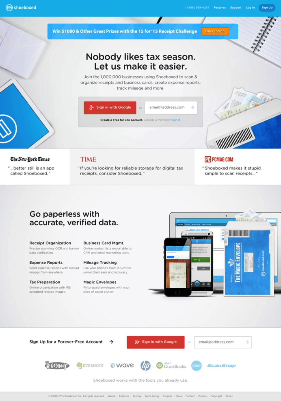
The top part of a landing page should have only one call to action. By minimizing the number of initial requests you ask of visitors, you have a better chance of getting them to take a first step and initiate the process.
Five Simple Steps does a great job of helping their visitors take the first step by having just one call to action and structuring the page in such a way that all images and elements on the page point toward the CTA, so the visitor's attention is immediately focused on it.

2. Avoid an Overload of Information
When it comes to your landing page, supplying information is important, but so is the location of the information. Though you may have many great advantages over your competitors, along with great features and a hundred reasons why a visitor should choose you, showering visitors with all those facts can be a major conversion killer.
The landing page below is an example of one with a lot of text that is both hard to read and distracting.
This information could be easily optimized by either introducing it entirely below the fold or placing the most important bullets above the fold in a less distracting area. Then, visitors who require further information or who would like to learn more about the service/product could scroll to get the information.
While designing the landing page below we decided to place the most important information – a strong headline and subtitle, the call to action, and a few main bullets – above the fold. Additional information was placed below the fold. (The red line indicates the fold area.) Visitors who scroll below the fold can see information on how the platform works and additional features.

3. Lead the Way for Your Customers
Help visitors take the first step in your funnel and tell them what to do. When visitors arrive on your landing page, they need direction. Do not assume that people will just read all your content and know what they need to do next.
Note how AT&T's landing page below has many elements on it, many colors, and various calls to action. From "submit" to "order now" and "call us today," the amount of content on the page and the various offers can be extremely distracting and hard to take in.

Your landing page elements play a vital role in directing your visitors' attention to a certain action. Use these elements to tell visitors what to do. For example, text isn't enough; our brains process images 60,000 times quicker than they process text, meaning an image will be the first element noticed by visitors. So, if used properly, an image can trigger people into action.
Note how Charity Water uses the different elements of the page below very well:
- The image of the girl looking at the call-to-action area directs visitor attention toward the button and shows people what to focus on.
- The call-to-action button is used to focus people on one task only. Getting people to donate money online is a huge challenge, but by placing bullets and additional information below the fold, Charity Water directs visitors to focus on only one task.

4. Watch Your Visitors
One way to understand how people engage with your landing page and find out if it is successful in not confusing your visitors is to watch others engage with it. There are two main ways to do this:
- Actually watch people – Ask friends, colleagues, and family who have never seen your landing page to check it out. Don't comment or explain the page to them. Watch intently and see what confuses them, what they find easy to do, and what their first natural reaction is to your page. Note the action they take when they first land on your page. These observations will allow you to see the positive emotions or frustrations of visitors.
- Use heatmaps – There are some great products and tools that can help you analyze visitor behavior. Using heatmaps, you can see what visitors are clicking on, where they start their experience, and what they actually do on your landing page. This data will help you immensely as you optimize your landing page.
An interesting case study on Crazy Egg demonstrated how using a heatmap (shown below) increased an ecommerce site's conversion rates with less than 5 minutes' work.

Examining their heatmap, this client noticed that visitors were not interested in the video they set up on their homepage. In fact, most people found it distracting and didn't watch the video or click on the promoted links below the video. With a better understanding of visitor experience, the client moved the video to a different area on the homepage (a 5-minute fix) and immediately saw uplift in conversion rates.
Wrapping Up
There are many cognitive biases that impact the decision-making process. By identifying them and being aware of them, we can make our visitors' decisions easier and quicker and, in turn, increase our revenue.


