The Power of Persuasion: Using Brain Science to Get Users to Act

This story originally appeared on KISSmetrics
Making fact-based, data-driven design decisions (say that five times fast!) is the mantra of Google, and who better to emulate than the Big Kahuna itself, right? That being said, utilizing data for web design isn’t always as easy as it sounds. But did you know there’s a heap of scientific research from the brainiacs at academic powerhouses, such as Stanford, Princeton and Harvard and the like that can help you persuade people to buy your product? I know… it sounds heavy, but let me make it easy. Just read on.
Here you’ll find three ways to design utilizing brain science data that will persuade your users to act. I’ve found word-of-mouth consumer research studies, marketing studies on fluent and disfluent typography, and cost transparency research that can all be applied to your next web design project. My hope is that this will help guide you in the right direction, one smartypants design decision at a time.
The Science & UX Behind Reviews
What does PTSD research, persuasive design and writing online reviews all have in common? Well, not much… except for one little connection that I learned of after talking with Dr. Sarah Moore, a prestigious consumer researcher hailing from the University of Alberta, Canada.
When Moore and her research group looked at past clinical psychology research on how journaling helps alleviate PTSD symptoms, they noticed that journaling helped some sufferers experience amazing, curative results, while others still suffered. Moore explained to me that the difference is people who wrote using what researchers call explaining language, (whereupon they sought to understand and evaluate their traumatic event), recovered better—but when they ruminate and re-lived the experience via journaling, they tended to get worse or stay the same.

How people feel after they write reviews that are positive or negative great affects the way the view the experience and describe it in future word-of-mouth situations.
Using this knowledge to power her own study, Moore looked at how people felt during and after writing positive or negative reviews. She determined that writing positive reviews using explaining language, words like “I feel because ABC,” or “I think this because XYZ,” made the reviewer feel less positive about the experience. Conversely, writing negative reviews made storytellers feel less negative when using the same explaining language.
Moore explained this phenom with her own experience as a child watching “Jurassic Park” with her sister. “We were terrified of that movie,” she said chuckling, “But then someone explained to us that all those “bone-crushing’ special effect sounds were actually created by breaking ice cream cones in toilet bowls and we weren’t really scared anymore. It unpacked the fears for us and made us less afraid.”
Her results are interesting, but you may be wondering, what are the implications for UX design? When businesses use reviews to build awareness, or use testimonials to create positive social proof, there may be a better way to design the review experience guided by her research.
Using Moore’s research as a guidepost, it could be suggested that making reviews available only via desktop could be viable, but what about the effects of negative reviewing on the fly? Those folks seem to self-soothe by ranting, so perhaps let them have their say. So maybe it’s about changing the design.

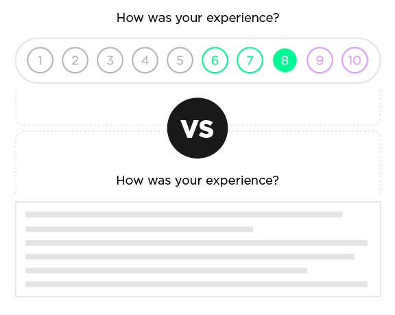
What if your review platform served up only canned questions with a rating scale of 1-10? This might alleviate the positive reviewer’s apathy while still allowing the negative reviewers a space to vent and forgive-and-forget.
Changing the paradigm so that people can easily offer a rating will help you maintain social proof without sacrificing the possible post-review apathy that Moore’s study highlights. After all, you want a positive reviewer to remain positive, so although a testimonial on your site is dandy, it’s not worth as much as a heart-felt referral to one of their colleagues. The more positive reviewers unpack their emotions about the experience and explain it thoroughly, the more they feel less attached to the positive emotions they had, and they may even lose sight of their love for your brand, or products, Moore explained.
Another creative approach is to solicit fact-based customer feedback ortestimonials. Storytelling may well be the ultimate weapon, but it works best in certain areas of a strategy. So, let’s not inadvertently shoot ourselves in the foot by asking “why,” “how come,” and the like.
Moore concluded in her final study that using explaining language makes reviewers “less likely to retell their experience in the future,” so with that in mind, use your design and copy wisely to make sure the happy campers and the not-so-happy ones walk away thinking and feeling more positively about your business, regardless of the emotions behind their sentiments.
Typography & Background: dO YoU knOW wHAT i WanT?
What is it about Facebook’s Status Update Form that makes people just spill their guts? I mean, you only have to look, here, or here, or here, for some really juicy stuff.
In 2009, Adam Alter, a marketing-focused researcher, best-selling author and professor at NYU decided to study this phenomenon. What he uncovered was quite interesting: “Cognitive fluency encourages self-disclosure.” To put it in layman’s terms: Using easy-to-read typography and contrasting elements persuades users to freely disclose some really embarrassing tidbits. These UI decisions can be made simply, and potentially have a huge impact.
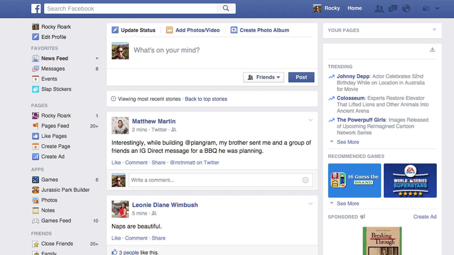
The simplicity of Facebook’s Status Update Form is, according to research, a winning way to encourage users to freely disclose their deepest, darkest thoughts.
Thanks to Alter’s research findings, we can now see the connection between typography and its effects of readability on user’s behavior.
Alter’s work suggests:
- Simplistic, serif typefaces — which are fluent—encourage people to disclose more information.
- Script-y, fancy typefaces — which are deemed disfluent (hard to read)—encourage people to disclose less personal information.
- Black text on a white background, versus the opposite, has the same effect as fluent typefaces—more disclosure.
The overarching results of these studies “suggested that people are less willing to disclose potentially damaging information about themselves when they experience disfluency,” Alter explained in the study’s introduction. “One likely explanation for this effect,” he went on to note, “is that people tend to experience diminished confidence and greater vigilance when they experience disfluency, which might temper their willingness to disclose self-incriminating attributes.”
The goal then, of all their work combined, was to show that there’s a distinct connection between how you present content and how it engages or disengages users. The implications of this for designers, product managers, and marketers is quite exciting! Let’s say you are soliciting your customers for their personal information—you want their name, address, email address, age, family size, maybe even their banking information. Using these insights to design your form could improve conversion rates.
Alter and his team of researchers found a website that was about to make a simple UI change, which would bolster their research because it was an organic, naturalistic setting for the study. The site was called Grouphug.com and the powers-that-be at Grouphug agreed to allow Alter to study their UI change, which was really quite small. All they were going to do was update their black background color to a white background color. And guess what? Confessors tended to disclose more embarrassing information on the white background than on the black, hard-to-see background.
Or, another use case could be surveying your customers or potential customers. Designing the right survey could be the key to garnering the type of unbridled criticism or praise that your company is seeking. For instance, Typeform uses a minimalist layout and design plus the ol’ black-fluent-font-on-a-white-background formula, too. The ease of which users can see, understand and visualize “the ask,” the more willing they are to give up the goods, so to speak.
Persuade with Pricing Transparency
Harvard Business School (HBS) is ripe with data on consumer research and pricing studies are a hot topic as of late. Bhavya Mohan, a doctoral marketing student, alongside HBS assistant professors, Ryan Buell and Leslie John, researched the phenomenon of pricing transparency in their recent paper, “Lifting the Veil: The Benefits of Cost Transparency.”. The results showed that “when a company selling T-shirts, for example, itemizes what it spends on cotton, cutting, sewing, dyeing, finishing, and transporting each shirt, consumers become more attracted to the brand and more likely to purchase.” In addition, the researchers also noted that whether or not the customer was brand spankin’ new or a longtime brand advocate, using cost transparency surfaced positive buying motivations.
Consumer’s apparently feel so positively about cost transparency because they consider it an “intimate disclosure.” In fact, they discovered that businesses can actually charge quite a lot above the actual cost of production before consumers start getting ticked off.
Dr. Buell interviewed with Working Knowledge, a news organization at HBS dedicated to showcasing their employees’ work and explained this phenom, “We wanted to understand when cost transparency would be harmful,” Buell said. “With a T-shirt that cost $6.50 to produce, it seemed reasonable to us that cost transparency would be helpful [in motivating buyers] if the price of the shirt was $10. But even at $35, we still saw an advantage to revealing the cost of production, which is interesting because the markup was five times the cost.”
What he noted during the research is that the markup could go quite high and consumers still didn’t care, as long as the pricing transparency was there. Surprising, in one of their studies checks-and-balances, they finally informed people in one condition that regardless of the transparency, they were indeed being price gouged. Then, and only then, did the pricing strategy fall apart. Folks needed to be told point-blank that it was a rip-off before they questioned the cost of the goods. Pretty amazing, huh?
To enforce their findings, as we noted, the researchers did look to the “real world” to study retailers that were actually using price transparency as a marketing strategy. Both Everlane and HonestBy augment this strategy. In an interview with Forbes, the CEO of Everlane, Michael Preysman, said of his pricing strategy:
“Before founding Everlane, I worked in venture capital. During my time there, I learned a lot about the astronomical markups in fashion. I really couldn’t understand why a shirt that cost $7 to make was selling at stores for $50 and up. We realized people had no idea of these markups and saw that there was a real need to educate consumers. At that moment, we decided to incorporate pricing and factory transparency with every product we make.”

Bloomberg reported on this pricing phenomenon, noting that, although Everlane sold only T-shirts back in 2011 when it launched, it now sells other types of clothing and boasts sales of about 30K tees, topping off at about $30 apiece. So clearly the transparency strategy isn’t slowing Everlane down.
Other companies are following suit, such as Zady and OfAKind, who show consumers how it was made via the production process to provide transparency in the manner in which it was crafted.
This also helps consumers understand the indirect cost and that cost may be higher because the product wasn’t produced in a “sweatshop” -esque environment.
In this instance, using the power of storytelling to convey the pricing strategy is useful if you have a competitive edge that you would like to remain private, or perhaps is also useful if you have so many manufacturers to account for that creating a transparent price may be too tricky to execute, the study showed. No matter your logic behind your technique, being honest and transparent with consumers seems to always provide big wins, as long as you’re being honest.
Are You Convinced?
Using scientific data and brain research studies to support design decisions isn’t cut-and-dry. But many of these techniques offer high yield for those willing to apply these findings to their business. For example, in one of the experiments on pricing transparency, the researchers noted that there was a 44 percent increase in sales for products with transparent pricing as opposed to not.
Alter’s font research showed up to 20-40 percent increases in disclosure when using content designed fluently.
Lastly, with Moore’s research on word-of-mouth, we can see significant indicators for how and why you encourage or showcase reviews of your products or services. This isn’t brain surgery, it’s brain science. Don’t be afraid to get your neurons a little wet!
About the Author: Lauren Ventura has been researching persuasion, reasoning and its effects on users, customers and everyone else since her graduate school days. Way back then, in her Rhetoric program, she learned the basics—Socrates, Plato and Aristotle—and the not-so-basics—the Toulmin Model. She’s found that there’s not much difference between user experience and those old Greeks—it’s all about convincing the right people with the right strategies in the right place. She currently works at a UX design agency, DigitalTelepathy, as their in-housecopywriter. Follow her on Twitter @DoItWriteNow.
Making fact-based, data-driven design decisions (say that five times fast!) is the mantra of Google, and who better to emulate than the Big Kahuna itself, right? That being said, utilizing data for web design isn’t always as easy as it sounds. But did you know there’s a heap of scientific research from the brainiacs at academic powerhouses, such as Stanford, Princeton and Harvard and the like that can help you persuade people to buy your product? I know… it sounds heavy, but let me make it easy. Just read on.
Here you’ll find three ways to design utilizing brain science data that will persuade your users to act. I’ve found word-of-mouth consumer research studies, marketing studies on fluent and disfluent typography, and cost transparency research that can all be applied to your next web design project. My hope is that this will help guide you in the right direction, one smartypants design decision at a time.
The Science & UX Behind Reviews
What does PTSD research, persuasive design and writing online reviews all have in common? Well, not much… except for one little connection that I learned of after talking with Dr. Sarah Moore, a prestigious consumer researcher hailing from the University of Alberta, Canada.


