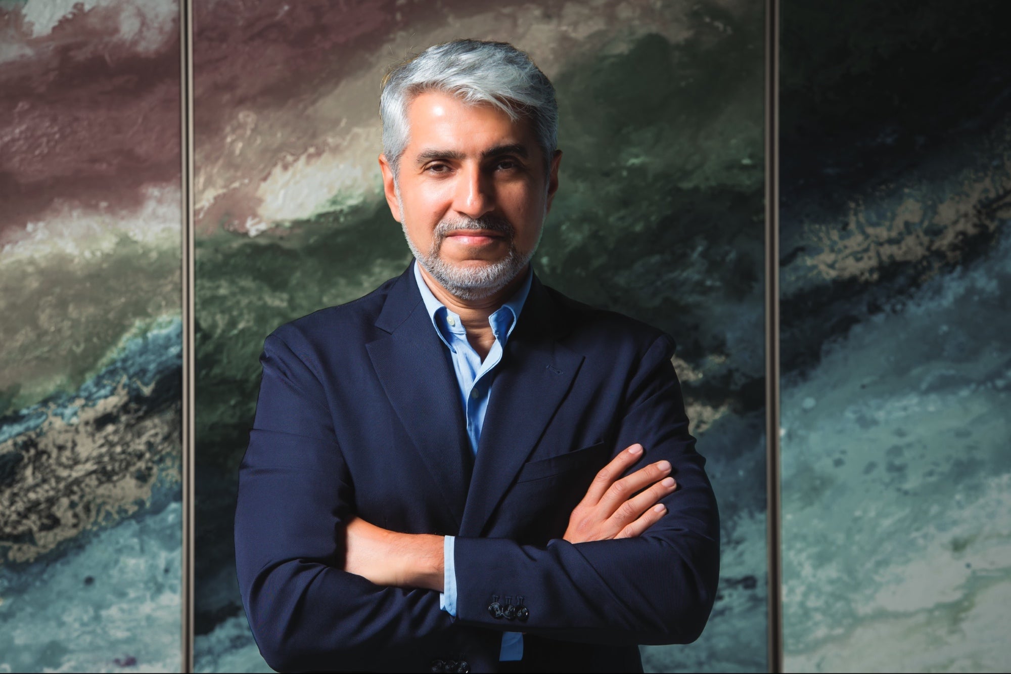
Seeing Double: Entrepreneur and Designer Tarek Atrissi Tarek Atrissi talks about how a well-executed typeface can become the voice of your brand.
Opinions expressed by Entrepreneur contributors are their own.
You're reading Entrepreneur Middle East, an international franchise of Entrepreneur Media.

"Good typography is when you look at the [type] as one logo design, not letters, " said Tarek Atrissi emphasizing how a well-executed typeface can become the voice of a brand at a session for the 2015 Dubai International Arabic Calligraphy Exhibition. The session explored supporting traditional art and including it in contemporary typographic expression. And Atrissi has definitely made it his life's work to explore the branding possibilities of typography- particularly bilingual typography. Born in Beirut, Tarek Atrissi has worked, lived and studied in Lebanon, The Netherlands, Qatar, Dubai, Spain, and the U.S. His enthusiasm for cultural endeavors began after being exposed to classic artists at a young age, while his interest in graphic design stemmed from how it's a relatively new discipline in the region.
The 36-year-old Lebanese-Dutch citizen holds a Masters of Arts in Interactive Multimedia from Utrecht School of the Arts, Holland, MFA in Design Entrepreneurship from the School of Visual Arts (SVA) in New York and a Postgraduate degree in Typeface Design from the Type@Cooper Program in New York. He later credits SVA for pushing him to take advantage of his creative background and pursue his entrepreneurial endeavors. His entrepreneurial training helped in understanding his clients- who are also often entrepreneurs. Acting as a facilitator to "bring their own ideas into the world," Atrissi advises them as he has executed ventures of his own. He established the Netherlands and Spain-based Tarek Atrissi Design studio in 2000, which focuses on branding, type design, exhibition design and general communications consultancy. The agency has made a name for themselves for their cross-cultural design work. As increasing design literacy in the region is part of their mission, education has also been part of their services, with design workshops and courses being held for teams and academic institutions.
.jpg)
So why did his design studio hone in on bilingual typography? Atrissi explains, "Our market in the Middle East is, at the end of the day, a bilingual market communicating often in more than one language." It's true, but in terms of deciding to focus his design practice on typography as a solution for branding projects, Atrissi points out how typography is a visual language on its own and in branding contexts –especially in logo design- using typefaces as main elements turns it to being "minimal, abstract and timeless." The lack of minimal design in the region is also one of Atrissi's motivations for mainly utilizing typography in graphic design. The challenge is keeping it legible when needed. It's essential as fonts and typefaces can become the voice of a brand. When you think of a red curved M, the first thing that comes to mind is, of course, McDonald's.
Likewise, Atrissi asserts the importance of sets of fonts that can be associated with a brand's identity, and how companies have clued in on typefaces' importance, and have begun asking for custom-made fonts. In adopting multilingual typeface design for corporations, Atrissi advises "respect[ing] the nature of each script- [don't] force the Arabic to look like the Latin script so that it becomes distorted. Vice versa, making a Latin typeface look Arabic by trying to draw it in a superficial calligraphic way and making it a "faux Arabe' kind of font is also a wrong move." The goal is to match the multilingual fonts harmoniously, but without sacrificing the authenticity or legibility of each language. To advocate good design in the region, Atrissi incorporates it to real life projects and brings it to the public as a successful example.
"Every country had its own influence and was a specific school of design that helped my design personality. The Arab world provided me with the interest in local culture, as well inspiration from our heritage and interpreting it for our current times. In Holland, I was inspired by the Dutch design approach, and by being in a country with a high level of visual culture and a methodological approach to the design process. New York was a school of design that stamped me with a hard-working and ambitious character, and allowed me to observe and study closely some of the living legends in design today and the way they work. The combination of these very different design cultures made me as a designer, and is a continuous rich blend of inspiration." His advice for graphic design and creative professionals thinking of venturing their own business in MENA? Go beyond design and build an interest in business- starting off with a business plan. After all, one needs to make sure one's creativity finds commercial viability in order to survive.

Source: Tarek Atrissi
"I am always fighting design cliches in our region that are used, abused and are wrongly associated with our Arabic culture and identity. There is a need to start thinking beyond the superficial and to create designs that are unique, and not too commonly illustrative."
GENERALIZATIONS Typical visuals and icons to illustrate Arabic culture such as the camel and the palm tree.
COLOR OVERUSE Golden color to suggest luxury, and green as an Islamic color.
LITERAL TRANSLATIONS Western brands translated into Arabic without any consideration as to how these would work in the local market.
ALI BABA TYPO Putting logos or words as English with an Arabic-looking font.
ALL INCLUSIVE LOGO Telling too much in a logo, instead of subtle messages- MENA is not yet used to minimalism.

Source: Tarek Atrissi
SAUDI DESIGN WEEK
"It gives me the opportunity to share my design philosophy and try to reach the wider mass in explaining the design needs of our region, and be critical about the pitfalls we often see in common design solutions. I [also] spoke about my project for the Riyadh Metro, the new public transport system in Saudi Arabia. As part of the branding of the metro, I have developed custom bilingual typeface design for the metro, to be the "written voice' of the brand. It was a good case study to share with the audience, as the new font for the metro is literally everywhere in the city of Riyadh, and it gave the audience a good practical sense of how a typeface can act as a recognizable component of any brand."
INNOVATE NOT IMITATE
"We should not blindly copy the design process and solutions created in the West as these could often not work with our local culture. It is important to keep the essence of our design solutions purely conceived to fit our culture, and hence end up representing our identity and be a unique design to our region."
EXECUTIVE EDUCATION
"My entrepreneurial spirit was certainly what helped get into all my ventures, so the graduate studies I did in New York was certainly a turning point and I do advise any designer aspiring starting an own business to support their creative profile with business education."

Source: Tarek Atrissi Design
THE BUSINESS OF DESIGN
MEET HALFWAY "Any design is the collaborative work of the designer and the client, so I do my best to have this relationship as collaborative as possible."
PROJECT MANAGEMENT "As a businessman, I try to keep in mind the timeframes and restrictions every project has and work on a design solution within it, because design is not [just] art, and it is tied to budgets and to commercial contexts."
PASSION PROJECTS "I remind myself to keep having fun and enjoying my work, because this is [the] reason why I got into design in the first place- my love for the design practice."
EXPLAIN YOUR STANCE "I try to [convince clients to forgo clichés] by building arguments based on real case studies and showing the many examples of how these clichés are used wrongly. Sometimes, it is best to explain good design by showcasing and analyzing bad design."
THE PORTFOLIO: TAREK ATRISSI PROJECTS
"Every project brings its own challenges and requirements into the process that are unique to it, and that is what makes the design process always interesting."
-page-001.jpg)
Source: Tarek Atrissi Design
BAHRAIN NATIONAL MUSEUM
As it was essential for the building's shape to be in the logo, the team studied the architectural concept of the building in depth. Eventually, instead of making a drawing of the building, they got inspired by the square-like forms of the iconic architecture and translated it into a typographic solution- where the museum name was designed in a square kufi style that reflected the floor plan of the museum.
JEEM TV
For Al-Jazeera's children's channel JEEM TV, the aim was to create a logo design that appeals to the aesthetics of children. This was not easy. I, as a designer, had to step out of my own preferences to create what really appeals to kids of various age groups.It involved setting up workshops with children to get them involved in the design process.-page-002.jpg)
Source: Tarek Atrissi Design
QATAR'S NATIONAL BRANDING
"This was a very unique and challenging project- for me to understand well the culture of a country and able to frame it into a brand, I had to move and live in Qatar for a year." In the end, it was a minimalist logo with a calligraphic style of the Arabic word Qatar that was constructed. To Arab readers, the logo was a visual signature of the nation, while non-Arab readers would see it as an aesthetic calligraphic shape-appealing to both demographics, particularly to outsiders, which was the goal for the tourism campaign.
VICTORIA & ALBERT MUSEUM EXHIBITION
The museum had a photography exhibition about the Middle East called Light from the Middle East: New Photography. The project's goal was to create an exhibition space that reflected the Middle East culture, without imposing over the works displayed. To avoid typical Arab design clichés, the design house used a hand-lettered street sign in Beirut as its main inspiration and theme for the design. The main entrance of the exhibition, large murals, introduction and section panels consisted of multiple layers of Latin and Arabic typography from the sign, while the negative space of the Arabic letters contributed to the concept of light, and at the same, depicted an accurate landscape of Middle East.


