What Google’s New Mobile-Friendly Changes Mean for You
Opinions expressed by Entrepreneur contributors are their own.
On February 26, Google dropped a major bomb in a seemingly-casual blog post on mobile-friendly search results. While the engine has always made mobile-readiness and the easy access of information a priority, it has now spelled out that it will use mobile-friendliness as a stronger ranking signal than ever before. It will also increase the presence of relevant app content in the search results.
So what does that mean for you? Basically, if you’ve been holding out on implementing a mobile strategy for your business website, it’s time to make this a top priority. Here’s how to do it.
Check your site’s mobile-friendliness
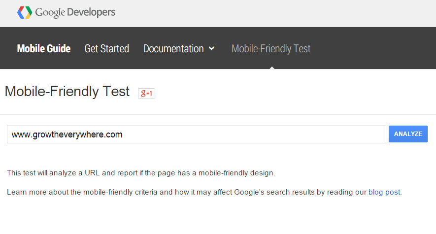
Google has made it easy to take the first step toward determining whether your site is set to take advantage of these new changes with its Mobile-Friendly Test. Simply open the page, enter your URL and click “Analyze.”
Google will then check your site and report whether or not it’s mobile-friendly. If your site qualifies, the tool will also return a screenshot of how your site currently appears on mobile devices.
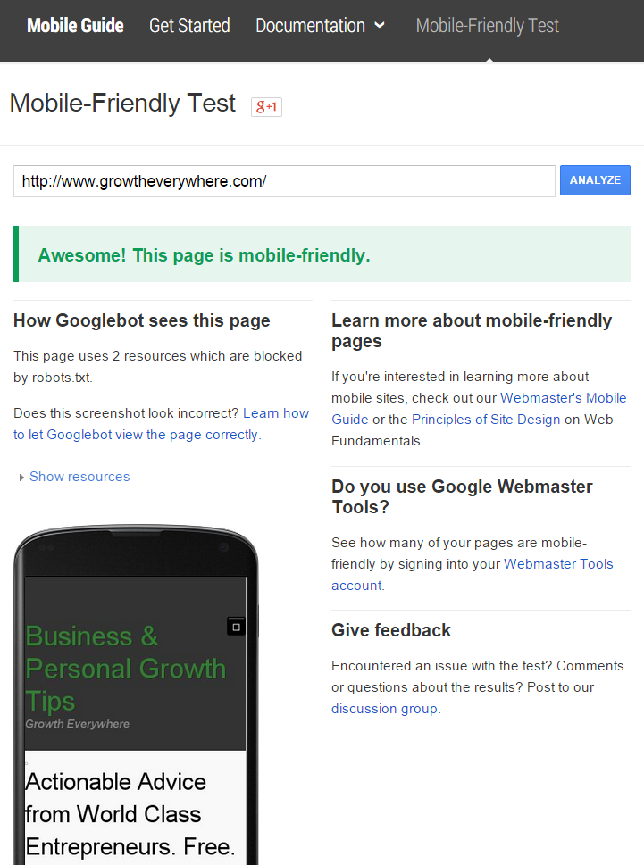
If your site ranks as mobile-friendly, you’re in good shape, though you’ll still want to read through the following recommendations. Just because your current design passes Google’s test doesn’t mean that there aren’t still ways for you to improve or things you’ll want to watch out for if you go through a website redesign in the future.
Related: Proceed With Caution: Should Smartphones Come With a Warning?
Fixing mobile-friendliness issues
If your site fails Google’s mobile-friendliness test, the program will report the specific issues that led to this determination.
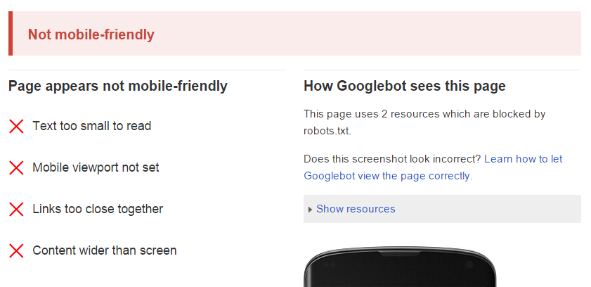
These recommendations will give you a starting place for the changes you’ll want to make to bring your site into compliance. Google also offers a helpful guide to getting started with mobile-friendly websites you can reference to help resolve these issues.
However, be aware that the issues Google reports may not be the only factors influencing your website’s mobile usability. For that reason, it’s a good idea to explore all of the following steps to ensure your mobile visitors are as comfortable on your site as your desktop users.
1. Is my site responsive?
In the past, website developers had several options to create a mobile site version, including custom coding a separate mobile site, deploying device-specific HTML sites based on the vary HTTP header tag, or using a responsive design that automatically adjusted to account for various device sizes.
Today, though, there are simply too many different device shapes and sizes for a single static mobile site to fit comfortably on all potential screens. Google’s official recommendation is now to use a responsive website design. Your developer or designer can tell you if your site uses this protocol. Or, if your mobile-friendliness test reports that your mobile viewport is not set (as above) or uses a fixed-width, there’s a good chance your site is not responsive and should be fixed ASAP.
2. Are scripts or other services interfering with my site’s usability?
If your desktop site makes use of pop-up lightbox scripts, exit intent banners or other similar types of technology, it’s critical that you ensure these programs are able to accommodate mobile users. There’s simply nothing more frustrating than having a banner pop up across your mobile web browser and being unable to close it.
At the same time, be sure that your site avoids the use of file types like Flash that either don’t display at all or display incorrectly on some mobile sites. Google’s priority is to get people the information they want, as quickly as possible — and they can’t do that if your files are too difficult to load.
Related: April 21 Is Your Last Chance for Mobile Optimization Before ‘Mobilegeddon’
3. How easy is it to navigate my mobile site?
In addition, remember that what looks good on your desktop website may not work as well on a mobile device. Keep all of the following considerations in mind as you evaluate your site’s mobile-friendliness.
- Make sure any tap targets are at least 48 CSS pixels tall/wide, and that you have at least 32 CSS pixels of both vertical and horizontal spacing between each tap target. Doing so will prevent inadvertent wrong-page clicks that can frustrate users.
- Use a base font with a size of at least 16 CSS pixels. Keep the number of fonts used to a minimum and maintain appropriate vertical spacing between rows of text.
- Adjust any graphic elements on your site that are currently using a fixed width formatting, as this will prevent your content — even when part of a responsive site design — from sizing appropriately for the viewport.
Finally, even if you think you’ve set up everything perfectly, test, test and test some more. Use mobile site emulators to view your website in different sizes and layouts. Ask friends and family members to navigate from their digital devices, or invest in paid user testing that’ll record the actions and reactions of anonymous visitors to your mobile site.
It may sound like a lot of work to guarantee mobile-friendliness, but it’s a vital part of keeping your visitors happy and maintaining your site’s search visibility.
On February 26, Google dropped a major bomb in a seemingly-casual blog post on mobile-friendly search results. While the engine has always made mobile-readiness and the easy access of information a priority, it has now spelled out that it will use mobile-friendliness as a stronger ranking signal than ever before. It will also increase the presence of relevant app content in the search results.
So what does that mean for you? Basically, if you’ve been holding out on implementing a mobile strategy for your business website, it’s time to make this a top priority. Here’s how to do it.
Check your site’s mobile-friendliness
Google has made it easy to take the first step toward determining whether your site is set to take advantage of these new changes with its Mobile-Friendly Test. Simply open the page, enter your URL and click “Analyze.”


