Why You Should Never Redesign Your Product or Website

This story originally appeared on KISSmetrics
For those about to engage in an epic design overhaul to take your product to the next level, I’ve got bad news for you. It’s probably not going to work.
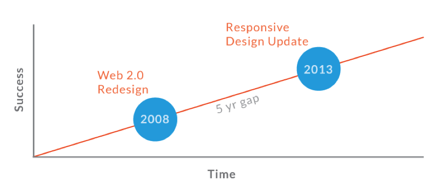
The revolutionary, or “out with the old and in with the new,” approach to redesign has been the norm for many years. Websites, in particular, are often overhauled every 3-5 years, but remain fairly static between updates. The overarching issue is these redesigns are often based purely on aesthetics, not analytical data or feedback from users, which means it’s impossible to determine if the new sites will outperform the old ones.
Thankfully, there’s a much better way to tackle product redesign, and it focuses on evolution, not revolution.
What is Evolutionary Redesign?
Evolutionary Redesign (ER) is the art and science of using strategic A/B testing to ensure your design updates lead to increases in conversions and revenue. This approach works best in scenarios where a brand itself is not broken, but its core digital product (e.g., application or website) needs to be improved.
You’re probably asking yourself, if ER is so great, why haven’t I heard more about it? The short answer is the revolutionary approach is sexier and more exciting. Digital products are often judged solely on their visual qualities, which leads to the misconception that as long as a product is using flashy new trends (e.g., responsive design, parallax effects, background videos, long scroll pages, etc.), it will be successful.
The decision to opt for a redesign often comes straight from the top. For example, an owner or C-level executive demands a design overhaul simply to prove their digital savviness or self-worth. Egocentric design is a brand’s worst nightmare, as it’s devoid of substance and lacks strategic input from real-world data that could otherwise determine which aspects of a product are working fine and worth salvaging.
Revolutionary Design: What brands assume will happen
Revolutionary Design: What really happens

Why Revolutionary Design Fails
Regardless of how many people are involved or how many hours internal team members spend on perfecting every pixel, the epic redesign is one of the most haphazard and careless decisions a brand can make. Here are some reasons it fails:
- Too much, too soon confuses the situation. Changing too much at once makes it impossible to determine what specific changes result in increases or decreases in conversions and revenue. For example, your new lead gen form design may be great, but what if the new design of the page it resides on leads to increased bounce rates?
- The success is deceptive. Even if you manage to increase conversions for a revamped page, the revolutionary approach doesn’t leave room for exploring whether the success level can be further increased. There’s a good chance that testing individual page elements can push the conversion rate even higher.
- Design alone can’t work miracles. Redesign is not a cure-all for fixing a flawed business model or declining sales. When times are desperate, many think redesigning will solve everyone’s problems, but that’s irresponsible wishful thinking.
- Most designers are not UX experts. Designers usually obsess over fonts, colors, and drop shadows and typically don’t consider how their design decisions will impact a product’s bottom line. Even the best of the best can’t predetermine which decisions will lead to optimal results. If function follows form, you’re setting yourself up for failure.
- Revolutionary design doesn’t consider user feedback. Do-overs are typically driven by a desire to keep up with trends or competitors and don’t take into account how actual users feel about the product. Without collecting feedback from real users, you’re doing them (and your brand) an injustice.
- Revolutionary design overlooks your analytics. Designing in a vacuum doesn’t allow for the collection and analysis of analytics data. Before a designer touches a product, there should be an analysis phase to pinpoint areas for improvement (e.g., need to increase conversions like sign-ups, downloads, or purchases).
- Epic overhauls take too long. Major redesigns can take many months, as big brands require designs to pass through multiple layers of approval and often have slow development cycles.
- Design by committee fails. Design is subjective and opinions on what is right or wrong will vary depending on whom you ask. This is why you should let analytics and A/B testing drive all design decisions.
- Global updates are hard to roll back: Once you pull the trigger on a massive update that impacts multiple aspects of your business (public perception, marketing campaigns, user experience, etc.), it’s nearly impossible to reverse it.
- Revolutionary design risks damaging SEO rankings. One of the most significant negative impacts of a redesign, is losing domain authority and SEO rankings, which can lead to drop-offs in traffic and revenue. Even carefully executed redesigns can result in SEO taking a nosedive, so haphazard do-overs that fail to consider how adding, removing, and updating pages and their associated on-site elements can lead to a major disaster that takes months or years to recover from.
Three Examples of Revolutionary Design Disasters
The following examples are well-documented cases of Revolutionary Redesign failing miserably:
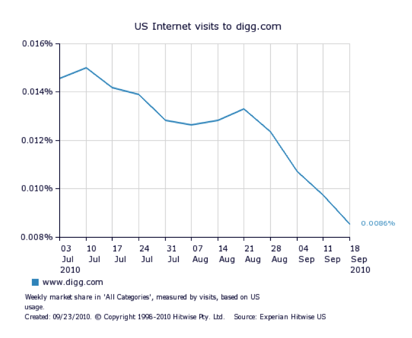
1. Digg.com
In 2010 the social bookmarking site Digg.com launched a website redesign that led to a 26% loss in web traffic. The site updates alienated loyal users who found the redesign so off-putting that many left and never returned.
Had Digg tested A and B versions of their redesigned pages and/or run usability tests, they could have spotted pain points early in the process and avoided the now infamous redesign fail.
2. Yahoo Mail
In an obvious effort to mimic Gmail, Yahoo redesigned its email platform not once, but twice in less than one year. The October 2013 update, in particular, spawned amassive public uproar resulting in an online petition at Change.org with over 40,000 signatures to bring back the old design.
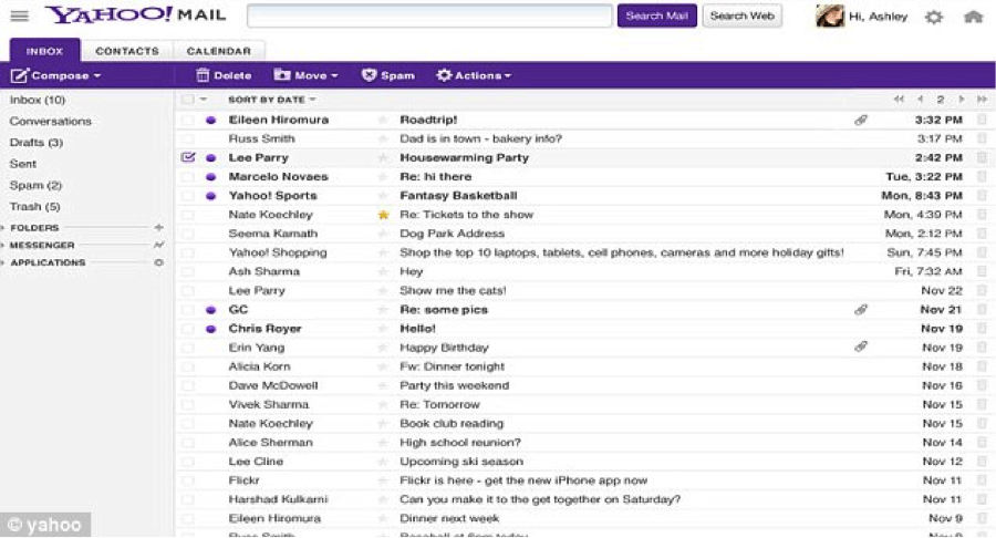
Yahoo Mail’s December 2012 design update
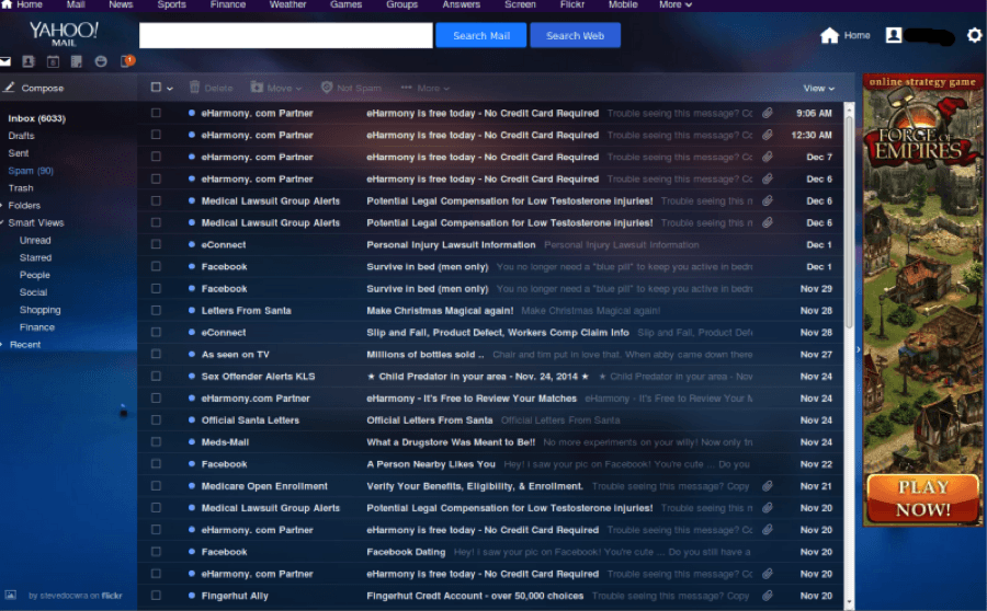
Yahoo Mail’s October 2013 design update
The Yahoo Mail redesigns were pushed through rapidly and led to mass confusion among loyal users. While the first redesign mainly focused on an updated look and feel, the second went a step further and removed several beloved features, like tabs and sort-by-sender. These decisions hindered user experience, upset loyalists, and even discouraged Yahoo employees from switching over to their own mail service. In fact, only 25% of Yahoo staff opted to use it.
3. CNN.com
Earlier this year, CNN rolled out a website redesign that has since been met with much controversy and vitriol. “It was definitely time for a new look,” said CNN Digital Editor-in-chief Meredith Artley. “The old site just didn’t reflect some of the shifts we’ve seen in our storytelling and audience over the last year.”

New CNN.com (left) vs. Old CNN.com (right)
According to CNN, the site updates focus largely on catering to the rise of social media and mobile readership. However, the updates have triggered outrage for some of the following reasons:
- The new homepage takes an average of 21.5 seconds to load and can cause CPU usage to eclipse 20%.
- The new homepage uses larger images, which reduces the number of headlines appearing above the fold and drastically increases the length of the page. This means more scrolling and hunting for news.
- The desktop navigation is clumsy and not intuitive.
Interestingly, CNN’s Artley also stated: “The days of the massive website relaunches are coming to an end,” and “It took us a long time to get this one out. We wanted to get this in a good place to launch it, but we also know that no site is ever perfect.”
These comments prove CNN is well aware that the revolutionary approach is no longer viable and caused the recent site update to take longer than anticipated.
Benefits of Evolutionary Redesign
An evolutionary approach to revamping your product gives you the benefit of blending both art (design) and science (analytical analysis) into a single process.

The most important benefits of Evolutionary Redesign include:
1. ER Minimizes Risk by Changing Only Elements That Improve Results
Far too often we see digital products undergo complete overhauls that alienate loyal customers by changing the experience so much that it becomes unfamiliar and frustrating. The ER approach prevents this from happening by forcing you to home in on fixing only what is really broken.
2. ER Focuses on Analytical Data Tied to ROI Rather than Aesthetics
Throughout the product redesign process, there may be dozens of individuals offering input on what’s best. From C-level executives to the cleaning lady, everyone has an opinion. Therefore, it’s not uncommon for lists of hundreds of suggested improvements to pile up and for small decisions (like a static homepage banner vs. a carousel) to take hours to make.
Amazingly, we’ve seen this process drag out for many months without anyone suggesting that analytical data be reviewed to determine which aspects of the product warrant change and which are working just fine and should be left alone.
Regardless of how stunning your front-end design looks, if it’s not created based on in-depth analytical data, it’s probably not going to result in a dramatic lift in performance.
3. ER Allows for Rapid Rollout of New Features
Global product updates take a tremendous amount of time to plan, design, develop, and launch. Evolutionary design allows for small updates to be applied and tested quickly and for a sequence of incremental updates to be rolled out over an extended time period.
This means your product will undergo constant improvement, which is a stark contrast to the revolutionary model, where there may be gaps of several years in between redesigns.
4. ER Bases Decisions on the Science of A/B Testing
The A/B testing component of ER allows design choices to be tested against the behavior of real users, which makes final decisions easy to make. If an orange button, for example, drives 15% more clicks, it’ll be difficult for anyone on your team to argue for a green one.
A/B testing performed in a controlled environment will always yield, at minimum, a decision that a hypothesis is incorrect or needs to be reconsidered. At best, it will reveal changes that dramatically improve conversions or revenue. There are many famous examples of brands using this exact process to increase revenue substantially by changing seemingly obscure elements like colors, text, and images.
5. ER Emphasizes the Importance of User Feedback
Unfortunately, many clients and consultants make design an ego-driven exercise. I’ve heard prestigious agencies tout that “we design what we would use.” But, what about the end user? Designing for the people who actively use and benefit from your product is the only true way to determine how you can better serve them, and serving your customers will intrinsically benefit your bottom line.
Challenges of Evolutionary Redesign
1. Requires patience (no instant gratification)
The digital industry is constantly changing and it’s only natural that products designed several years ago will have a dated appearance. It’s tempting to opt for a visual overhaul for the sake of showing your competitors and customers you’re savvy and on-trend; however, evolutionary redesign demands that form follow function.
This means science before art, and no design for the sake of design. Incremental updates aren’t always glamorous, but they make up for it by driving results.
2. Requires dedication to analytics and testing
Owners of digital products are often under immense pressure to implement revolutionary design updates. Convincing not only an owner but their entire team to buy in to a slow and methodical process that can take years to fully accomplish is not an easy task.
A/B testing is best when done incrementally, feature-by-feature, and is missing the wow factor that has made major overhauls so desirable.
3. Requires a capable and experienced team
One of the biggest hurdles for a brand looking to test the waters of ER, is the need to hire staff or retain a consultant capable of successful execution. This increases overhead initially, but with a capable team in place, the reward outweighs the risk.
4. Cannot be precisely budgeted
One appealing aspect of hiring a consultant to execute a one-off redesign is that they will typically provide a flat rate cost. This makes yearly budgeting easier and ensures upper management is fully aware of what to expect.
With ER, testing is ongoing and there really is no end point that can be used for predicting how much money will be spent. The A/B testing process and rollout of features will impact product performance and revenue. So, money spent vs. money earned is closely tied to how efficient and effective the ER process is.
When to Consider Evolutionary Redesign
If your sales are down or your website is outdated, that does not mean your brand is broken. If your company is established and the brand itself is healthy, there’s no reason to sound the fire alarm and shock your audience with a jarring do-over.
From a high level, these are some reasons to consider an ER approach:
- You want to maximize ROI
- You want to minimize risk
- Lifetime customer value is important to your business
- You want to improve your product continually, rather than waiting every few years
- You want to see increased performance, along with improved aesthetics
The Evolutionary Redesign Process
The ER process starts with determining why a redesign is needed and which aspects of your product are underperforming and should be generating more revenue. The safest route is to test individual elements; however, you may also redesign an entire page or feature. This will depend on what your analytics data reveals.
The crux of the ER method is incremental A/B testing, aimed to isolate specific elements in order to learn how they impact a page or feature. Surprisingly, even minor changes can have profound impacts on your bottom line. For enterprise level products, a conversion increase of a few percentage points can equate to a dramatic boost in revenue.
If you’re new to A/B testing, we recommend reading Quick Sprout’s Definitive Guide to Conversion Optimization to get a feel for best practices prior to running your first test.
A Step-by-step Overview of the Evolutionary Redesign Process
1. Identify Key Conversions
A conversion is any action that contributes to positive business growth (i.e., leads, customers, or sales) and can vary depending on your business model.
Here are some typical examples of conversions:
- Downloads
- Free trial sign-ups
- Ecommerce purchases
- Email opt-ins
- New user registrations
- Friend referrals
- Phone calls
- Form completions (e.g., request for info)
- Live chat sessions
2. Use Analytics Data to Identify Underperforming Conversions
Pinpoint areas of your product that are not driving sufficient conversions. This can be a specific page, feature, or function. Hopefully, you have proper analytics tracking installed, with the ability to track conversions. If not, you’ll be shooting in the dark.
Here are some examples of analytical data that indicate areas for improvement:
- New user registrations are low
- Shopping cart abandonment is high
- Key landing pages have high bounce rates
- Form completions are low and/or form drop-off is high
3. Pick a Conversion-related Element to be Redesigned
If you’ve never attempted anything like this and want to dip your toes in the water, choose just one of the conversions you listed in the previous step, and start planning your first update.
Let’s imagine you have a product landing page with a “Free Trial” form that is not driving sufficient leads. There are several tests you can run to determine how conversions can be increased.
Here are a few test options:
- Change the text on the “Submit” button
- Change the color of the “Submit” button
- Change the verbiage used in the heading above the form
4. Design an Alternate or “B” Version of Your Chosen Element
Let’s pretend you’ve chosen the lead gen form button as your control and have decided on button text as the variable. The existing verbiage is “Sign Up” and you’ll be testing a “B” version that uses “Start My Free Trial.”
5. Run Your A/B Test
There are several powerful online tools that allow you to run A/B tests on the fly without the need to spend time developing custom pages or features. For simple tests, our favorites are Visual Website Optimizer and Optimizely. For more advanced testing, Google Content Experiments is our top choice; however, it requires your pages to be designed and coded prior to testing.
Here are some tips from Quick Sprout:
- Always test until there is at least a 95% chance to beat the original variation (or vice versa).
- Consider running your test for 7 days to make sure the measured result can stand the test of time.
Extra hint: Use KISSmetrics’ A/B Testing Report to see how your test affects customer retention months down the road!
6. Choose a Winner
A review of the test analytics reveals the “B” button version generated 20% more clicks. This is a good sign that changing the button verbiage permanently will lead to a sustained increase in sign-ups.
7. Choose another Element to A/B Test, and Repeat the above Steps
The most important aspect of the ER method is to never stop testing. Establish a testing process and a calendar for when updates will be rolled out. Keep track of which experiments work, and which do not.
Also, keep in mind that all tests will not be successful. You may learn that a particular change doesn’t stand the test of time and therefore needs to be re-worked.
The good news is that since you’re making small incremental updates, losses will pale in comparison to the revolutionary approach, and they are easy to reverse if necessary.
Conclusion
It’s tempting to swing for the fences and revamp your product in one fell swoop. But, history and analytics prove this model of redesign simply doesn’t cut it.
The only way to guarantee that aesthetics and performance will be simultaneously enhanced, is via methodical and continual updates over a sustained time period.
Now, get out there and start testing!
Resources
For those about to engage in an epic design overhaul to take your product to the next level, I’ve got bad news for you. It’s probably not going to work.
The revolutionary, or “out with the old and in with the new,” approach to redesign has been the norm for many years. Websites, in particular, are often overhauled every 3-5 years, but remain fairly static between updates. The overarching issue is these redesigns are often based purely on aesthetics, not analytical data or feedback from users, which means it’s impossible to determine if the new sites will outperform the old ones.
Thankfully, there’s a much better way to tackle product redesign, and it focuses on evolution, not revolution.
What is Evolutionary Redesign?
Evolutionary Redesign (ER) is the art and science of using strategic A/B testing to ensure your design updates lead to increases in conversions and revenue. This approach works best in scenarios where a brand itself is not broken, but its core digital product (e.g., application or website) needs to be improved.
You’re probably asking yourself, if ER is so great, why haven’t I heard more about it? The short answer is the revolutionary approach is sexier and more exciting. Digital products are often judged solely on their visual qualities, which leads to the misconception that as long as a product is using flashy new trends (e.g., responsive design, parallax effects, background videos, long scroll pages, etc.), it will be successful.
The decision to opt for a redesign often comes straight from the top. For example, an owner or C-level executive demands a design overhaul simply to prove their digital savviness or self-worth. Egocentric design is a brand’s worst nightmare, as it’s devoid of substance and lacks strategic input from real-world data that could otherwise determine which aspects of a product are working fine and worth salvaging.
Revolutionary Design: What brands assume will happen
Revolutionary Design: What really happens
Why Revolutionary Design Fails
Regardless of how many people are involved or how many hours internal team members spend on perfecting every pixel, the epic redesign is one of the most haphazard and careless decisions a brand can make. Here are some reasons it fails:
- Too much, too soon confuses the situation. Changing too much at once makes it impossible to determine what specific changes result in increases or decreases in conversions and revenue. For example, your new lead gen form design may be great, but what if the new design of the page it resides on leads to increased bounce rates?
- The success is deceptive. Even if you manage to increase conversions for a revamped page, the revolutionary approach doesn’t leave room for exploring whether the success level can be further increased. There’s a good chance that testing individual page elements can push the conversion rate even higher.
- Design alone can’t work miracles. Redesign is not a cure-all for fixing a flawed business model or declining sales. When times are desperate, many think redesigning will solve everyone’s problems, but that’s irresponsible wishful thinking.
- Most designers are not UX experts. Designers usually obsess over fonts, colors, and drop shadows and typically don’t consider how their design decisions will impact a product’s bottom line. Even the best of the best can’t predetermine which decisions will lead to optimal results. If function follows form, you’re setting yourself up for failure.
- Revolutionary design doesn’t consider user feedback. Do-overs are typically driven by a desire to keep up with trends or competitors and don’t take into account how actual users feel about the product. Without collecting feedback from real users, you’re doing them (and your brand) an injustice.
- Revolutionary design overlooks your analytics. Designing in a vacuum doesn’t allow for the collection and analysis of analytics data. Before a designer touches a product, there should be an analysis phase to pinpoint areas for improvement (e.g., need to increase conversions like sign-ups, downloads, or purchases).
- Epic overhauls take too long. Major redesigns can take many months, as big brands require designs to pass through multiple layers of approval and often have slow development cycles.
- Design by committee fails. Design is subjective and opinions on what is right or wrong will vary depending on whom you ask. This is why you should let analytics and A/B testing drive all design decisions.
- Global updates are hard to roll back: Once you pull the trigger on a massive update that impacts multiple aspects of your business (public perception, marketing campaigns, user experience, etc.), it’s nearly impossible to reverse it.
- Revolutionary design risks damaging SEO rankings. One of the most significant negative impacts of a redesign, is losing domain authority and SEO rankings, which can lead to drop-offs in traffic and revenue. Even carefully executed redesigns can result in SEO taking a nosedive, so haphazard do-overs that fail to consider how adding, removing, and updating pages and their associated on-site elements can lead to a major disaster that takes months or years to recover from.
Three Examples of Revolutionary Design Disasters
The following examples are well-documented cases of Revolutionary Redesign failing miserably:
1. Digg.com
In 2010 the social bookmarking site Digg.com launched a website redesign that led to a 26% loss in web traffic. The site updates alienated loyal users who found the redesign so off-putting that many left and never returned.
Had Digg tested A and B versions of their redesigned pages and/or run usability tests, they could have spotted pain points early in the process and avoided the now infamous redesign fail.
2. Yahoo Mail
In an obvious effort to mimic Gmail, Yahoo redesigned its email platform not once, but twice in less than one year. The October 2013 update, in particular, spawned amassive public uproar resulting in an online petition at Change.org with over 40,000 signatures to bring back the old design.
Yahoo Mail’s December 2012 design update
Yahoo Mail’s October 2013 design update
The Yahoo Mail redesigns were pushed through rapidly and led to mass confusion among loyal users. While the first redesign mainly focused on an updated look and feel, the second went a step further and removed several beloved features, like tabs and sort-by-sender. These decisions hindered user experience, upset loyalists, and even discouraged Yahoo employees from switching over to their own mail service. In fact, only 25% of Yahoo staff opted to use it.
3. CNN.com
Earlier this year, CNN rolled out a website redesign that has since been met with much controversy and vitriol. “It was definitely time for a new look,” said CNN Digital Editor-in-chief Meredith Artley. “The old site just didn’t reflect some of the shifts we’ve seen in our storytelling and audience over the last year.”
New CNN.com (left) vs. Old CNN.com (right)
According to CNN, the site updates focus largely on catering to the rise of social media and mobile readership. However, the updates have triggered outrage for some of the following reasons:
- The new homepage takes an average of 21.5 seconds to load and can cause CPU usage to eclipse 20%.
- The new homepage uses larger images, which reduces the number of headlines appearing above the fold and drastically increases the length of the page. This means more scrolling and hunting for news.
- The desktop navigation is clumsy and not intuitive.
Interestingly, CNN’s Artley also stated: “The days of the massive website relaunches are coming to an end,” and “It took us a long time to get this one out. We wanted to get this in a good place to launch it, but we also know that no site is ever perfect.”
These comments prove CNN is well aware that the revolutionary approach is no longer viable and caused the recent site update to take longer than anticipated.
Benefits of Evolutionary Redesign
An evolutionary approach to revamping your product gives you the benefit of blending both art (design) and science (analytical analysis) into a single process.
The most important benefits of Evolutionary Redesign include:
1. ER Minimizes Risk by Changing Only Elements That Improve Results
Far too often we see digital products undergo complete overhauls that alienate loyal customers by changing the experience so much that it becomes unfamiliar and frustrating. The ER approach prevents this from happening by forcing you to home in on fixing only what is really broken.
2. ER Focuses on Analytical Data Tied to ROI Rather than Aesthetics
Throughout the product redesign process, there may be dozens of individuals offering input on what’s best. From C-level executives to the cleaning lady, everyone has an opinion. Therefore, it’s not uncommon for lists of hundreds of suggested improvements to pile up and for small decisions (like a static homepage banner vs. a carousel) to take hours to make.
Amazingly, we’ve seen this process drag out for many months without anyone suggesting that analytical data be reviewed to determine which aspects of the product warrant change and which are working just fine and should be left alone.
Regardless of how stunning your front-end design looks, if it’s not created based on in-depth analytical data, it’s probably not going to result in a dramatic lift in performance.
3. ER Allows for Rapid Rollout of New Features
Global product updates take a tremendous amount of time to plan, design, develop, and launch. Evolutionary design allows for small updates to be applied and tested quickly and for a sequence of incremental updates to be rolled out over an extended time period.
This means your product will undergo constant improvement, which is a stark contrast to the revolutionary model, where there may be gaps of several years in between redesigns.
4. ER Bases Decisions on the Science of A/B Testing
The A/B testing component of ER allows design choices to be tested against the behavior of real users, which makes final decisions easy to make. If an orange button, for example, drives 15% more clicks, it’ll be difficult for anyone on your team to argue for a green one.
A/B testing performed in a controlled environment will always yield, at minimum, a decision that a hypothesis is incorrect or needs to be reconsidered. At best, it will reveal changes that dramatically improve conversions or revenue. There are many famous examples of brands using this exact process to increase revenue substantially by changing seemingly obscure elements like colors, text, and images.
5. ER Emphasizes the Importance of User Feedback
Unfortunately, many clients and consultants make design an ego-driven exercise. I’ve heard prestigious agencies tout that “we design what we would use.” But, what about the end user? Designing for the people who actively use and benefit from your product is the only true way to determine how you can better serve them, and serving your customers will intrinsically benefit your bottom line.
Challenges of Evolutionary Redesign
1. Requires patience (no instant gratification)
The digital industry is constantly changing and it’s only natural that products designed several years ago will have a dated appearance. It’s tempting to opt for a visual overhaul for the sake of showing your competitors and customers you’re savvy and on-trend; however, evolutionary redesign demands that form follow function.
This means science before art, and no design for the sake of design. Incremental updates aren’t always glamorous, but they make up for it by driving results.
2. Requires dedication to analytics and testing
Owners of digital products are often under immense pressure to implement revolutionary design updates. Convincing not only an owner but their entire team to buy in to a slow and methodical process that can take years to fully accomplish is not an easy task.
A/B testing is best when done incrementally, feature-by-feature, and is missing the wow factor that has made major overhauls so desirable.
3. Requires a capable and experienced team
One of the biggest hurdles for a brand looking to test the waters of ER, is the need to hire staff or retain a consultant capable of successful execution. This increases overhead initially, but with a capable team in place, the reward outweighs the risk.
4. Cannot be precisely budgeted
One appealing aspect of hiring a consultant to execute a one-off redesign is that they will typically provide a flat rate cost. This makes yearly budgeting easier and ensures upper management is fully aware of what to expect.
With ER, testing is ongoing and there really is no end point that can be used for predicting how much money will be spent. The A/B testing process and rollout of features will impact product performance and revenue. So, money spent vs. money earned is closely tied to how efficient and effective the ER process is.
When to Consider Evolutionary Redesign
If your sales are down or your website is outdated, that does not mean your brand is broken. If your company is established and the brand itself is healthy, there’s no reason to sound the fire alarm and shock your audience with a jarring do-over.
From a high level, these are some reasons to consider an ER approach:
- You want to maximize ROI
- You want to minimize risk
- Lifetime customer value is important to your business
- You want to improve your product continually, rather than waiting every few years
- You want to see increased performance, along with improved aesthetics
The Evolutionary Redesign Process
The ER process starts with determining why a redesign is needed and which aspects of your product are underperforming and should be generating more revenue. The safest route is to test individual elements; however, you may also redesign an entire page or feature. This will depend on what your analytics data reveals.
The crux of the ER method is incremental A/B testing, aimed to isolate specific elements in order to learn how they impact a page or feature. Surprisingly, even minor changes can have profound impacts on your bottom line. For enterprise level products, a conversion increase of a few percentage points can equate to a dramatic boost in revenue.
If you’re new to A/B testing, we recommend reading Quick Sprout’s Definitive Guide to Conversion Optimization to get a feel for best practices prior to running your first test.
A Step-by-step Overview of the Evolutionary Redesign Process
1. Identify Key Conversions
A conversion is any action that contributes to positive business growth (i.e., leads, customers, or sales) and can vary depending on your business model.
Here are some typical examples of conversions:
- Downloads
- Free trial sign-ups
- Ecommerce purchases
- Email opt-ins
- New user registrations
- Friend referrals
- Phone calls
- Form completions (e.g., request for info)
- Live chat sessions
2. Use Analytics Data to Identify Underperforming Conversions
Pinpoint areas of your product that are not driving sufficient conversions. This can be a specific page, feature, or function. Hopefully, you have proper analytics tracking installed, with the ability to track conversions. If not, you’ll be shooting in the dark.
Here are some examples of analytical data that indicate areas for improvement:
- New user registrations are low
- Shopping cart abandonment is high
- Key landing pages have high bounce rates
- Form completions are low and/or form drop-off is high
3. Pick a Conversion-related Element to be Redesigned
If you’ve never attempted anything like this and want to dip your toes in the water, choose just one of the conversions you listed in the previous step, and start planning your first update.
Let’s imagine you have a product landing page with a “Free Trial” form that is not driving sufficient leads. There are several tests you can run to determine how conversions can be increased.
Here are a few test options:
- Change the text on the “Submit” button
- Change the color of the “Submit” button
- Change the verbiage used in the heading above the form
4. Design an Alternate or “B” Version of Your Chosen Element
Let’s pretend you’ve chosen the lead gen form button as your control and have decided on button text as the variable. The existing verbiage is “Sign Up” and you’ll be testing a “B” version that uses “Start My Free Trial.”
5. Run Your A/B Test
There are several powerful online tools that allow you to run A/B tests on the fly without the need to spend time developing custom pages or features. For simple tests, our favorites are Visual Website Optimizer and Optimizely. For more advanced testing, Google Content Experiments is our top choice; however, it requires your pages to be designed and coded prior to testing.
Here are some tips from Quick Sprout:
- Always test until there is at least a 95% chance to beat the original variation (or vice versa).
- Consider running your test for 7 days to make sure the measured result can stand the test of time.
Extra hint: Use KISSmetrics’ A/B Testing Report to see how your test affects customer retention months down the road!
6. Choose a Winner
A review of the test analytics reveals the “B” button version generated 20% more clicks. This is a good sign that changing the button verbiage permanently will lead to a sustained increase in sign-ups.
7. Choose another Element to A/B Test, and Repeat the above Steps
The most important aspect of the ER method is to never stop testing. Establish a testing process and a calendar for when updates will be rolled out. Keep track of which experiments work, and which do not.
Also, keep in mind that all tests will not be successful. You may learn that a particular change doesn’t stand the test of time and therefore needs to be re-worked.
The good news is that since you’re making small incremental updates, losses will pale in comparison to the revolutionary approach, and they are easy to reverse if necessary.
Conclusion
It’s tempting to swing for the fences and revamp your product in one fell swoop. But, history and analytics prove this model of redesign simply doesn’t cut it.
The only way to guarantee that aesthetics and performance will be simultaneously enhanced, is via methodical and continual updates over a sustained time period.
Now, get out there and start testing!


