15 Throwback Web Pages That Show Us How the Internet Has Changed

Opinions expressed by Entrepreneur contributors are their own.
Today, having a functional, strategic website is the norm — in 2015, more Americans shopped online than they did in stores, and 3.2 billion people were using the internet — but it wasn’t always that way.
Since the invention of the World Wide Web in 1991, companies have been forced to design and redesign their websites based around the needs of the ever-changing consumer.
We dug up the home pages of 15 popular companies using the WayBack Machine and used them to show just how much the internet has changed.
Note: Wayback Machine has been capturing significantly more images of these websites since 2012. We used a good number of images of websites from 2013 because there is a large number of screenshots to choose from at that point in time as reference, but we also dug way back in the archives Apple, The White House and NASA.
Related: The Public World Wide Web Turns 25:
Founders of AOL, Twitter and More Share the Best and Worst Moments in Internet History
13 Pivotal Internet Moments That Forever Changed How We Live, Work and Play
15 Throwback Web Pages That Show Us How the Internet Has Changed
Why the Internet Needs the WayBack Machine, the Site That Archives the Web
15 Internet Relics We Miss (and Some We Don’t)
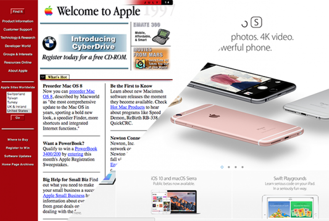
1997: Apple
In 1997, Apple‘s website featured a “what’s hot” button and a brightly colored sidebar. “It was about the flash, the design, the cheesy colors. People are trying to figure out what websites are,” says Dave McGowan, president and co-owner of Stectech, a website design company that has worked with companies such as Google and GE.
MacBook2013: WikiHow
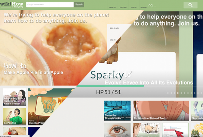
WikiHow‘s webpage hasn’t changed much. However, after 2013, WikiHow quickly learned that the search feature needs to be prominent.
Candelita1998: Google
In 1998, Google was using exclamation points (even in its brand) and was loosely designed, but the search giant has worked to make its website highly sophisticated and brand itself across many platforms. “There is a mature feature set in everything Google does,” says David Sieren, director of design at One Design Company, a graphic design company in Chicago. “We want functionality. We want to use it as a tool as quickly and efficiently as possible.”
2013: The Huffington Post
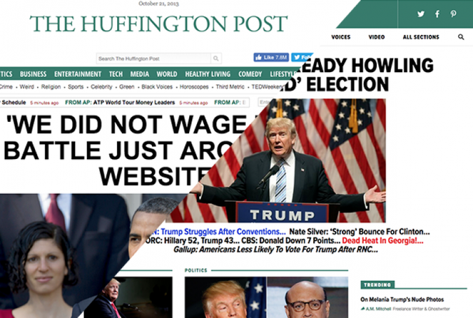
In 2013, The Huffington Post was pushing as much content to viewers as possible by using features such as a scrolling ticker. “They are a news site, so I understand why they put that up there, but that’s on it’s way out,” McGowan says. “People want content that’s easily digestible and sometimes those scrollers aren’t.”
Today, The Huffington Post is trying to direct readers to the most important material. The Huffington Post, along with many other websites, have started using “sticky content,” which remains on the page as you scroll. For example, The Huffington Post‘s navigation bar at the top and its video section are “sticky.” By using this strategy, you are driving visitors deeper down in the site and attracting readers to content that creates revenue, McGowan says.
2013: IMDb
In 2013, IMDb hadn’t tapped into multimedia and the user experience. The website hardly used any video at all, which isn’t ideal for a website that promotes video content.
Today, IMDb has captured the multimedia experience. “IMDb is more cinematic, it’s more immersive, which is the experience that you have when you got to the movies,” Dopazo says.
IMDb has found a way to keep viewers scrolling down by often giving its homepage a theme (as of this writing the latest Jason Borne movie) and it also made the website more immersive, Dopazon says. “Going to the movies is about the senses,” she says. “It’s good to translate that experience without being very obvious.”
1996: Yahoo
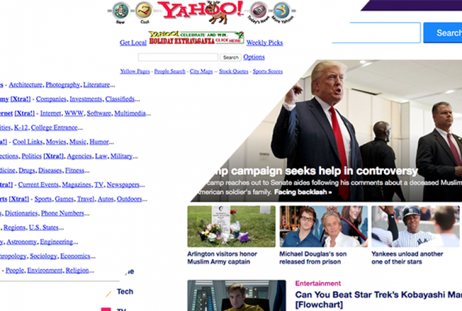
Similar to Google, Yahoo used to employ clipart, icons and an outdated interface on its site. “It’s amazing to look back in 1996 and look back at how unsophisticated the online landscape was,” Sieren says. “It’s a hot mess.”
2013: NFL
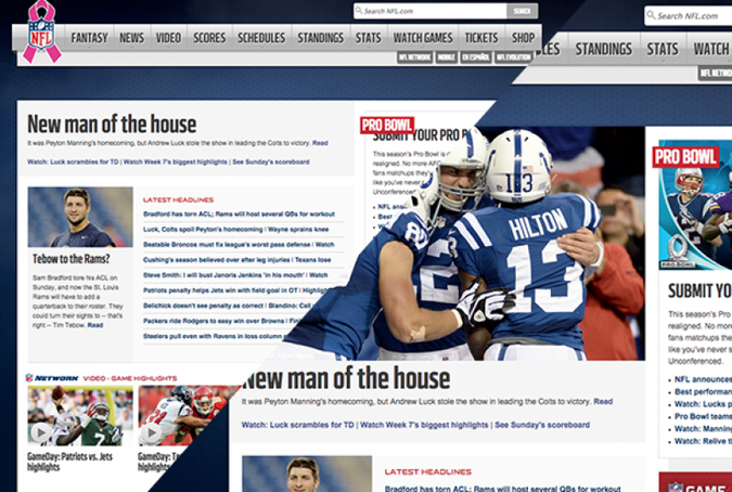
Interestingly enough, the NFL hasn’t changed its website much from 2013 to today — and it’s not because the design is working. “Two thumbs down for the NFL, unfortunately,” McGowan says.
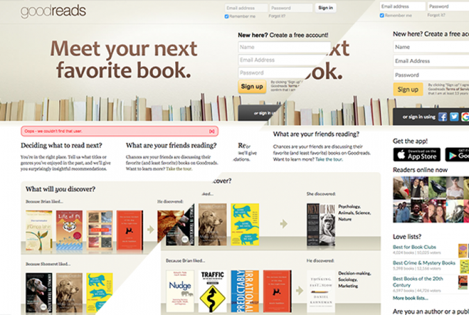
2013: GoodReads
GoodReads is another website that hasn’t changed significantly, which is likely due to the nature of the company and the devices that people access the website from. “I only use it on my devices. I don’t go to it in a browser,” Dopazo says. “Their data has noted that.”
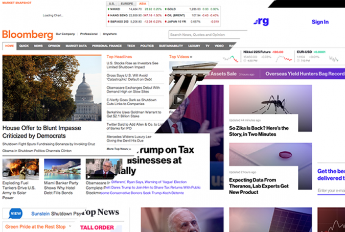
2013: Bloomberg
Even from 2013 to today, Bloomberg has drastically changed its website. “The turnaround between three years ago and today is so dramatic in a positive light,” Sieren says.
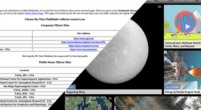
1996: NASA
Like the White House, NASA‘s website wasn’t entirely sure what it was supposed to be in 1996. It was focused on being a database, instead of branding. “Their logo isn’t anywhere. They just put some text and some links for other websites,” McGowan says. “Quite a bit is missing from this.”
Today, the website uses many photos and looks to show off projects. “They realized that branding is important and they put their logo on the site,” McGowan says.
2013: Food Network
In 2013, Food Network was trying to attract viewers to as many headlines as possible, but today it uses visual content to draw readers in. “They understand how your eye might scan the website,” Dopazo says. “Everything has its own space and order, it feels cleaner.”
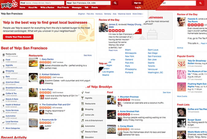
2013: Yelp
Yelp is another website that hasn’t updated much since 2013. “I don’t think that matters,” Sieren says. “They have an app that’s ubiquitous.”
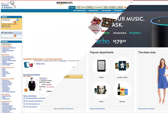
2005: Amazon
In 2005, Amazon hadn’t quite figured out how powerful images and browser histories are. “Today, they load those prominent images through your browsing history,” McGowan says. “Leveraging that history back in 2005 could have produced a much higher revenue stream for them.”
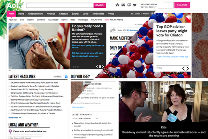
2013: AOL
AOL has not only changed its user interface, but has figured out exactly what visitors are looking for and taken advantage of it. AOL has now created categories for viewers and highlights them with a sidebar. “What we have now is the bar on the left, which is the main goals that they are assuming the readers are going to the page for,” Dopazo says.
1996: The White House
In 1996, government websites had not found their purpose. They were mostly being used as a database search tool. “It was unknown what a website should be,” McGowan says. “They didn’t know what type of content to put on there.”
The modern White House website design is simple and has intuitive navigation, McGowan says, which allows for easy accessibility from a broad audience. More important, the website is a branding tool for both the president and the United States by using images and logos. “It’s image heavy, having that branding experience,” McGowan says. “They don’t have any branding whatsoever on their old one.” The website even has a “photo of the day” section.
Related: 4 Reasons to Be Excited by the ‘Internet of Things’Today, having a functional, strategic website is the norm — in 2015, more Americans shopped online than they did in stores, and 3.2 billion people were using the internet — but it wasn’t always that way.
Since the invention of the World Wide Web in 1991, companies have been forced to design and redesign their websites based around the needs of the ever-changing consumer.
We dug up the home pages of 15 popular companies using the WayBack Machine and used them to show just how much the internet has changed.
 apple
apple