Creating a Visual Language for Innovative Products
How good designers master the tools of shape, color and movement to build solid user interfaces – and great ones use them to develop products that become the industry standards of tomorrow.
Opinions expressed by Entrepreneur contributors are their own.
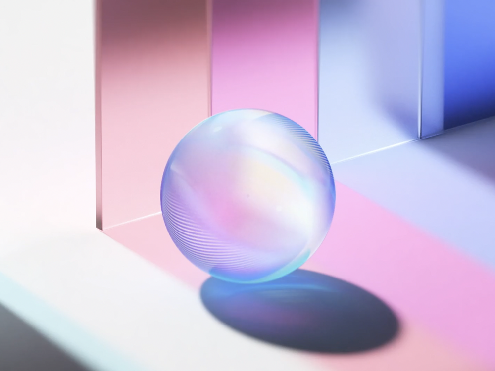
We take many things in our environment for granted: materials, textures, shadows and reflections. Sometimes we think of these visual attributes in isolation, but the true power is when they work together, reinforce each other and make a design alive.
The Grass sphere created for the Pryon project (see video link below) is an excellent example of creating magic using simple objects and elements — an artwork that gives viewers an impression of something real, something tactile. That happens because the sphere reflects light and rotates naturally, just as an organic object found in an everyday environment would. This design can work particularly well for products involving artificial intelligence (such as AI assistants), because it will help users transfer their thoughts and feelings from real-world objects to AI-based experiences. It helps create a connection between a user and a digital object, ultimately leading to better user engagement.
Related: Learn How Product Design Can Inform All Aspects of Your Company
Depth
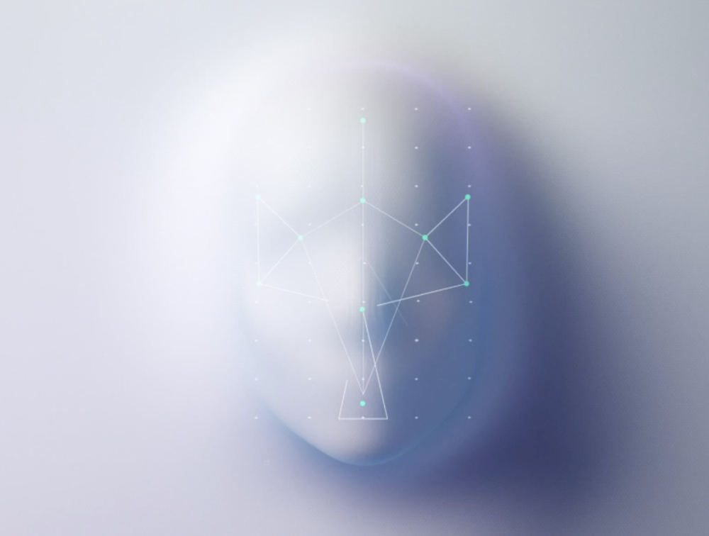
The era of flat design is almost over. The rise of augmented reality (Google Lens) and virtual reality (Metaverse from Meta) products has forced the design community to find new ways to convey information. Because AR- and VR-based experiences happen in pseudo or real 3D, we need to use tools that will help us design objects that fit naturally in augmented or virtual environments. One way to achieve this is to use depth in design, as it helps convey a sense of dimension. Depth can be created using two visual attributes: shapes and shadows. Every object in the real world casts shadows, and shadow reinforces shape. The same rule applies in digital design. With the rise of the computational power of modern devices, it becomes easier to create complex 3D effects that seem natural to the eye. Designers can then create more realistic compositions (such as the one below) and blur the boundaries between real and digital.
Color
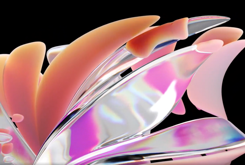
Color has a tremendous psychological effect, and plays a significant role in how people perceive design. Dull colors create an impression of lifelessness, while vibrant ones fill a design with life and energy, but ultimately a palette should be selected based on the emotions you want to convey. Product designers are the people who have the power to define how the future will look, so let’s make the future bright!
The following artwork features neon colors that create a positive vibe and give viewers a sense of excitement while they interact with the product — the “motion language” used reinforcing this feeling.
Related: Infographic: Psychology of Color In Branding
Timing
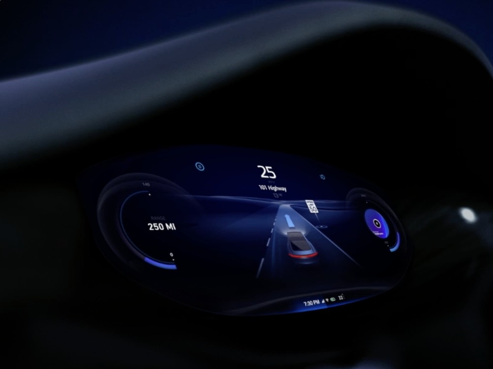
When it comes to motion design, timing is everything. When you create a motion effect, it’s not enough to create the right transition: it also should look smooth to a viewer’s eye, and that’s only possible when you select the right timing. To understand this concept more thoroughly, you need to train your eye and take inspiration from real-world objects… perhaps movement of waves on the sea, or leaves in the wind.
In the following example, the viewer’s camera slowly changes the angle, allowing every detail of the composition to be seen. Creating a comfortable experience for the viewer’s eye makes it much easier to comprehend the artwork.
Dream big
Bob Ross, art instructor and famed television host, once said, “All you need to paint is a few tools, a little instruction and a vision in your mind.” I couldn’t agree more, and believe further that vision is the most critical part of product design. When you understand where you want to go, you can select the right tools and give relevant instructions to your team, but the secret of creating a visual language for innovative products is to understand the nature of a product and reinforce this feeling in your visual design.
We take many things in our environment for granted: materials, textures, shadows and reflections. Sometimes we think of these visual attributes in isolation, but the true power is when they work together, reinforce each other and make a design alive.
The Grass sphere created for the Pryon project (see video link below) is an excellent example of creating magic using simple objects and elements — an artwork that gives viewers an impression of something real, something tactile. That happens because the sphere reflects light and rotates naturally, just as an organic object found in an everyday environment would. This design can work particularly well for products involving artificial intelligence (such as AI assistants), because it will help users transfer their thoughts and feelings from real-world objects to AI-based experiences. It helps create a connection between a user and a digital object, ultimately leading to better user engagement.
Related: Learn How Product Design Can Inform All Aspects of Your Company


