It’s In the Way That They Use It
Website design and usability are critical to converting eyeballs to sales.
The Internet offers a wealth of new opportunity for small businesses, but web surfers are a sensitive bunch. One wrong move and your new customers could be forever lost in the ether. Keep them happy by following these website usability guidelines.
Get organized. Most Internet users appreciate a familiar website layout and can become confused when presented with nontraditional formats. Give them what they want. Visitors typically start scanning a web page at the top left corner and move diagonally down to the bottom right, so it makes sense to place your logo and navigation at the top of the page. The main content and teasers to deeper information should be in the center of the page.
Easier = better. Visitors should be able to find any content on your site within a few clicks. Arrange your navigation in descending order of popularity with concise and obvious labels. Be wary of fancy drop-down or pop-out menus, as they can be cumbersome and annoying to use (but effective if executed properly).
All the news that fits. The age-old newspaper term “above the fold” is also applicable to website content. Most visitors should never have to scroll horizontally. If it’s not possible to fit the contents of your homepage in one screen (requiring no scrolling whatsoever), be sure to make the most important content the most visible.
Ask for the sale. The call to action is one of the most vital and often-overlooked components in small business websites. Don’t forget why you have a website in the first place. Your new potential customer visited your beautifully designed, highly usable website and read your well-crafted marketing literature. but then what? You should have a line of copy at the end of every page with a brief but convincing sales pitch that includes your contact information. Better yet, include a lead form on every page that utilizes a hook to get users to submit their information. Free consultations and whitepapers are good resources and provide incentives to visitors to submit their contact information.
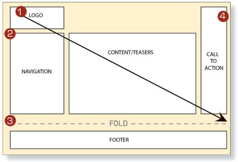
1) Users scan your website starting at the top left corner and move diagonally down to the bottom right of the page.
2) A deliberately placed navigation with clear labels helps visitors quickly find the content they’re perusing.
3) Always place the most important content “above the fold” so that visitors don’t have to scroll to find it.
4) Create a clear call to action and offer a simple lead form for potential customers to make initial contact.

Nicholas Chilenko is president of Nicholas Creative, a boutique agency in Michigan specializing in web design and Internet marketing.
The Internet offers a wealth of new opportunity for small businesses, but web surfers are a sensitive bunch. One wrong move and your new customers could be forever lost in the ether. Keep them happy by following these website usability guidelines.
Get organized. Most Internet users appreciate a familiar website layout and can become confused when presented with nontraditional formats. Give them what they want. Visitors typically start scanning a web page at the top left corner and move diagonally down to the bottom right, so it makes sense to place your logo and navigation at the top of the page. The main content and teasers to deeper information should be in the center of the page.
Easier = better. Visitors should be able to find any content on your site within a few clicks. Arrange your navigation in descending order of popularity with concise and obvious labels. Be wary of fancy drop-down or pop-out menus, as they can be cumbersome and annoying to use (but effective if executed properly).


