Arby’s Expensive Revamp: Two Logos in Two Years

Opinions expressed by Entrepreneur contributors are their own.
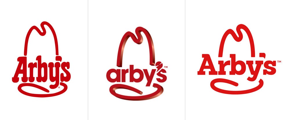
Arby’s has a new logo—again.
The new logo, which replaces the logo that was created just a year ago, was introduced at Arby’s National Franchise Conference in October. In November, it popped up in a commercial for Arby’s French Dip and Swiss. Now, the new logo has subtly replaced the old one on Arby’s social media sites.
With bold red lettering reminiscent of the chain’s original lettering and hat, the new logo “will start appearing in our print advertising/coupons, point-of-purchase (POP) collateral and merchandising materials in January,” says Arby’s communications manager Jason Rollins. “Restaurant signs will update on a rolling schedule as needed, beginning early next year.”
Related: A Racist Sign at Sonic and 5 Other Franchise PR Disasters
Amazingly, the “old” Arby’s logo was only a year old. In October 2012, Arby’s rolled out a brand relaunch with a “modernized” logo, new tagline of “Slicing Up Freshness” and a website refresh. The revamp was the work of Adrienne Weiss Corporation and Alcone Marketing with Crispin Porter & Bogusky.
Reactions were almost immediately negative. Critics called the logo a “travesty,” “forced,” and “half-baked.” Brand New’s poll of 3,600 individuals found that 93 percent disliked the update. The attempt to refresh the brand had fallen flat.
In 2013, Arby’s hired a new CEO and CMO. In October, AdWeek reported that Arby’s was searching for a new creative agency, turning away from Crispin Porter & Bogusky, the agency responsible for the rebranding. Arby’s hopes to have a final decision on the replacement agency by early 2014.
Arby’s annual media spending approaches $125 million each year. However, the real money from a logo revamp is not necessarily in advertising, but instead in replacing the countless items on which the logo appears. Point-of-purchase collateral and merchandising materials can encapsulate everything from stationery and business cards to brochures and napkins. Two redesigns in two years is a costly expense, no matter what you pay your ad agency.
Ultimately, Arby’s new logo is a return to a refreshed version of an old favorite. With no big announcement to highlight the change, reactions have been quieter, but much more positive than in 2012. In the words of one Facebook commenter: “I’m glad they went to one that’s more like the original! Stay true to your roots Arby’s!”
What do you think of Arby’s redesign—an expensive change or a necessary correction?
Related: Goodbye Bacon, Hello Health Food: 6 Restaurant Trends for 2014
Arby’s has a new logo—again.
The new logo, which replaces the logo that was created just a year ago, was introduced at Arby’s National Franchise Conference in October. In November, it popped up in a commercial for Arby’s French Dip and Swiss. Now, the new logo has subtly replaced the old one on Arby’s social media sites.
With bold red lettering reminiscent of the chain’s original lettering and hat, the new logo “will start appearing in our print advertising/coupons, point-of-purchase (POP) collateral and merchandising materials in January,” says Arby’s communications manager Jason Rollins. “Restaurant signs will update on a rolling schedule as needed, beginning early next year.”


