The Step-By-Step Guide on Creating Infographics
This story originally appeared on Visual.ly
Creating an infographic can be a daunting task if you’ve never built one before. There is a long list of things that need to be done, and it takes a varied skill set to accomplish all of them. Below is an example of the process.
Pick a Topic
The first step in creating an infographic is to decide on a story you want to tell. One great way to go about this is to decide why you want to tell that story. Do you want to showcase your company’s capabilities? Do you simply want to share something cool or interesting? Are you reporting on accomplishments or performance? In this case we wanted to share something interesting; the aid policy of the United States.
Get the Data
The next step is to figure out the exact story and make sure you have data that supports it. Enigma is a fantastic way to navigate the world of public data – quickly searching and analyzing through billions of public records. We pulled the Creditor Reporting System simply by using the topics browser and applying “International Development” and “Government Spending” topic filters. Enigma instantly pulled 58,355 rows of data for analysis. The next step was use Enigma to filter down to the official development assistance and project type intervention to remove bilateral flows and debt forgiveness by filtering for project type interventions in classification column and removing non-zero contracts amounts . That got us down to 44,779 records, a decent quantity to export to CSV and explore further in BlockSpring.
Related: 3 Free Tools for Creating Your Own Infographics
Check the Story
Having the data and knowing exactly what the data says are two very different things. One of the best ways to figure out what data says is to explore it using interactive visualizations. But doing so requires some serious coding.
On Blockspring, engineers post visualizations and analyses you can easily use with you own data – all without needing to code. It’s a community-driven library of functionality.
Looking at the data in Blockspring revealed some interesting things:
First, it seemed that each country gets aid from a different set of agencies. For instance Columbia and Congo get most of their aid from the Export-Import Bank, while Afghanistan and Haita get most of their aid from USAID. Maybe agencies have different reasons for giving aid…
The next step was to look at the relationship between agencies and the purpose for their aid. It’s quite obvious that each agency has a 1-3 core reasons for giving aid. For instance the Department of Agriculture almost exclusively budgets aid for “Food Security’, while the Department of State almost exclusively budgets aid for “Government and Civil Society’. This shows generally what the aid agenda is between various agencies and countries.
Finally, since each country gets money from different agencies, and each agency gives money for a different reason, what if each country was grouped by all the reasons they receive aid? A Blockspring K-means clustering template can provide that view, showing that the US has a few core strategies for giving. There are countries who receive money primarily for “Food Security”, and others for “Public Health”. And it’s not immediately obvious which countries fall into which category.
This is one step closer to a data driven story. The data has shown that there is strategy behind the US budget for aid, and it can be partially inferred from the data – but it still needs to be wrapped up in a clean, intuitive story.
Related: 7 Super Tips for Creating Powerful Infographics
Finalize the Story
That’s where Visually comes into the picture. Having a coherent story that can be communicated visually is critical to a successful infographic. Tania Haas, one of Visually’s talented Journalists took the preliminary research and put it together into a script. After two drafts, the script gave a great overview of the topic and backed it up with plenty of data.
Build the Infographic
Amelie B. made quick work of the script with a first draft sketch of the graphic.
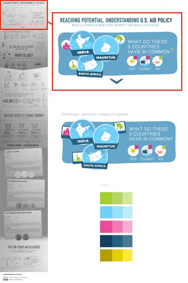
The second draft brought the piece into full color and the third draft simplified much of the text and took care of minor edits to the visuals. We’re thoroughly satisfied with the final outcome.

After the infographic was completed, it was uploaded to Visual.ly. Uploading it to Visual.ly provides an embed code for placing it around the web, gives people a place to comment on it, and provides a way to track its performance all over the web using Visually’s own Native Analytics.
Infographics are a great way to summarize information into a digestable format, but that means putting a lot of work into that summary. Tools like Enigma and BlockSpring can help you deal with the data. Services like Visually are a great way to get the last summarization done and turn the data into a beautiful and effective design.
Paul Katsen from Blockspring (@Blockspring) and Craig Danto from Enigma (@Enigma_io) also contributed to this article.
Creating an infographic can be a daunting task if you’ve never built one before. There is a long list of things that need to be done, and it takes a varied skill set to accomplish all of them. Below is an example of the process.
Pick a Topic
The first step in creating an infographic is to decide on a story you want to tell. One great way to go about this is to decide why you want to tell that story. Do you want to showcase your company’s capabilities? Do you simply want to share something cool or interesting? Are you reporting on accomplishments or performance? In this case we wanted to share something interesting; the aid policy of the United States.
Get the Data
The next step is to figure out the exact story and make sure you have data that supports it. Enigma is a fantastic way to navigate the world of public data – quickly searching and analyzing through billions of public records. We pulled the Creditor Reporting System simply by using the topics browser and applying “International Development” and “Government Spending” topic filters. Enigma instantly pulled 58,355 rows of data for analysis. The next step was use Enigma to filter down to the official development assistance and project type intervention to remove bilateral flows and debt forgiveness by filtering for project type interventions in classification column and removing non-zero contracts amounts . That got us down to 44,779 records, a decent quantity to export to CSV and explore further in BlockSpring.


